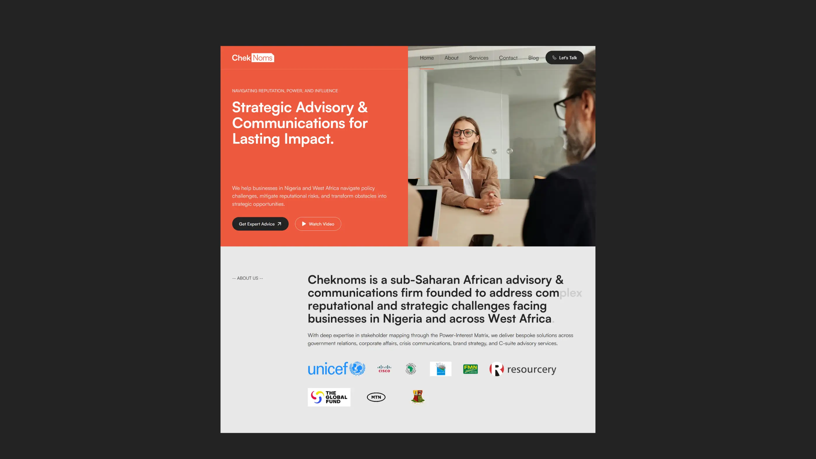
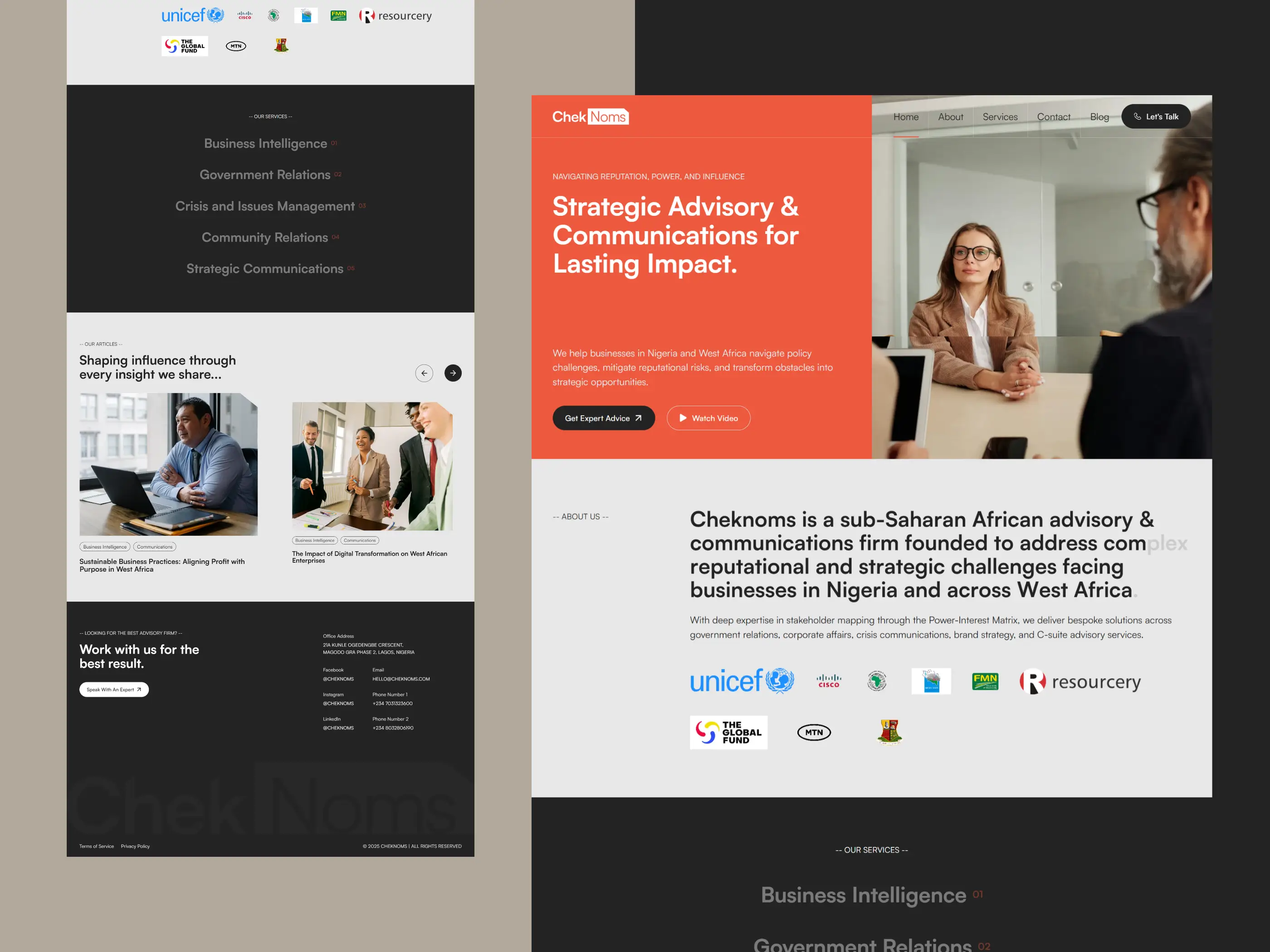
Global Appeal, Local Authority: Inspired by the clean professionalism of their reference, we delivered a site that communicates trust, clarity, and sophistication. A minimalist layout, carefully balanced whitespace, and subtle interactions gave the brand a sleek digital feel, just enough flair without distraction from the core message.
Purposeful Visual Direction: We suggested the colour palette and worked with the recommended typography, while the brand identity was handled by our highly talented colleague. Every layout decision was made to reinforce the vibe of a premium, globally aware communications firm with West African roots.
Copy That Communicates Confidence: Using the client’s raw business content as a base, we crafted website copy that introduces ChekNoms with clarity and confidence. The messaging focuses on trust, strategic clarity, and industry authority, keeping things simple but impactful.
Built for Growth: We included a blog section for thought leadership content and a streamlined contact form to make it easy for prospects to get in touch. On top of that, subtle hover effects and micro-interactions were custom-tuned to strike a balance between sleek and serious, elevating the overall user experience.
The client’s response, shared via our design partner who contracted us, was simple but telling:
“He absolutely loved the final website. It really captured the brand’s essence and ambition.”